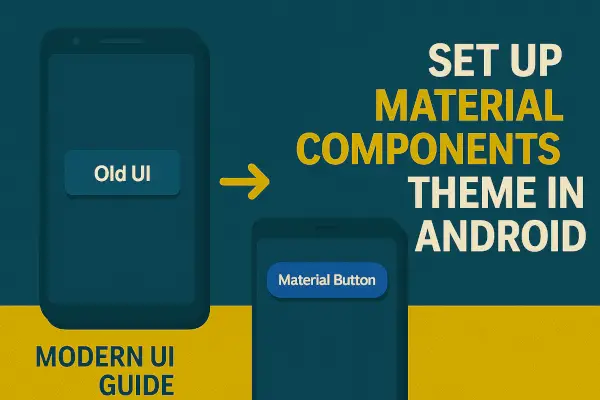
Material Components for Android (MDC) is Google’s official design framework for building modern, beautiful, and consistent UIs across Android apps. It includes ready-made themes, components like buttons, cards, navigation drawers, and more—all designed to enhance user experience.
With Material You and M3 design becoming the standard, it’s crucial to upgrade your Android app’s theme using MDC.
This guide will walk you through:
- Adding Material Components dependencies
- Updating your
themes.xml - Applying widgets and styling for a clean, responsive UI
📦 Step 1: Add Material Components to Your Project
In your build.gradle (app), add the Material Components dependency:
dependencies {
    implementation 'com.google.android.material:material:1.10.0' // or latest version
}
Then sync your Gradle files.
🎯 Step 2: Update Your Theme to Use Material Components
Open your res/values/themes.xml file and change your base theme to a Material Components variant.
<resources xmlns:tools="http://schemas.android.com/tools">
    <style name="Theme.MyApp" parent="Theme.Material3.DayNight.NoActionBar">
        <!-- Customize your theme here -->
        <item name="colorPrimary">@color/primary</item>
        <item name="colorSecondary">@color/secondary</item>
        <item name="android:statusBarColor" tools:targetApi="l">@android:color/transparent</item>
    </style>
</resources>
📝 You can also use Theme.MaterialComponents.DayNight.DarkActionBar for backward compatibility if not using Material 3.
🧱 Step 3: Set Theme in AndroidManifest.xml
Ensure your app uses the new theme:
<application
    android:theme="@style/Theme.MyApp"
    ... >
</application>
💡 Step 4: Use Material Components in Layout
Now you can start using Material widgets:
<com.google.android.material.button.MaterialButton
    android:layout_width="wrap_content"
    android:layout_height="wrap_content"
    android:text="Material Button" />
Other popular components include:
MaterialCardViewTextInputLayoutBottomNavigationViewMaterialToolbarFloatingActionButton
🎨 Step 5: Customize Your Theme Colors (Optional)
In res/values/colors.xml, define your Material color palette:
<color name="primary">#6200EE</color>
<color name="primaryVariant">#3700B3</color>
<color name="secondary">#03DAC5</color>
Then apply these in your theme file.
⚙️ Optional: Enable Material 3 (M3)
Material 3 (a.k.a. Material You) brings updated colors, typography, and design behaviors. To enable it:
- Use
Theme.Material3.*variants in your theme - Use the Material 3 widgets provided by the latest material library
- You can migrate from M2 to M3 progressively
Switching to Material Components Theme modernizes your Android UI instantly. It offers consistency, adaptability for dark/light mode, and integration with newer Android APIs.
With just a few changes in XML and dependencies, you unlock:
- Beautiful built-in widgets
- Better theming and styling
- Smooth animations and responsiveness
Are you planning to upgrade your app to Material 3?
Let us know your challenges or share a screenshot of your new UI in the comments! 💬👇