Alert dialogs are an essential part of Android apps, providing a way to display important information or ask users to make decisions. Material Components make it easy to create modern, visually appealing alert dialogs that align with Google’s Material Design principles. In this blog post, we will walk you through how to create an alert dialog with buttons using Material Components in Android.
We will cover everything from setting up the environment to customizing the dialog to ensure it fits your app’s style. This guide is suitable for both beginners and experienced developers looking to implement consistent UI elements across their Android applications.
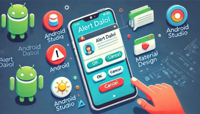
What Is an Alert Dialog?
An alert dialog is a popup window that appears in front of the current activity, used to grab the user’s attention for important information or decision-making. Common use cases for alert dialogs include:
- Confirming actions, like deleting a file.
- Displaying critical information that requires the user’s acknowledgment.
- Gathering simple input from the user.
Alert dialogs usually have a title, message, and one or more action buttons that allow users to interact.
Using Material Components to Create an Alert Dialog
Material Components provide a modern and consistent way to create alert dialogs. Using the MaterialAlertDialogBuilder class, you can easily implement dialogs that follow Material Design guidelines.
Step 1: Add Material Components to Your Project
To use Material Components, ensure that the library is added to your project. Add the following dependency to your app-level build.gradle file:
implementation 'com.google.android.material:material:1.8.0'This library provides the tools needed to create Material-styled components, including alert dialogs.
Step 2: Create the Alert Dialog
To create an alert dialog with buttons, use the MaterialAlertDialogBuilder class. Below is an example of how to implement an alert dialog with an OK button, a Cancel button, and a Neutral button.
import com.google.android.material.dialog.MaterialAlertDialogBuilder
import android.os.Bundle
import androidx.appcompat.app.AppCompatActivity

class MainActivity : AppCompatActivity() {
    override fun onCreate(savedInstanceState: Bundle?) {
        super.onCreate(savedInstanceState)
        setContentView(R.layout.activity_main)

        // Show the alert dialog when the activity starts
        showAlertDialog()
    }

    private fun showAlertDialog() {
        MaterialAlertDialogBuilder(this)
            .setTitle("Delete Confirmation")
            .setMessage("Are you sure you want to delete this item?")
            .setPositiveButton("OK") { dialog, _ ->
                // Action when "OK" is clicked
                dialog.dismiss()
            }
            .setNegativeButton("Cancel") { dialog, _ ->
                // Action when "Cancel" is clicked
                dialog.dismiss()
            }
            .setNeutralButton("More Info") { dialog, _ ->
                // Action for "More Info" button
            }
            .show()
    }
}
In this example:
- Title: The title of the dialog informs the user about the action they are about to take.
- Message: The message provides more context about the action.
- Positive Button: Used to confirm the action (e.g., “OK”).
- Negative Button: Used to cancel the action (e.g., “Cancel”).
- Neutral Button: Provides additional options or information (e.g., “More Info”).
Customizing Your Alert Dialog
Material Components allow you to easily customize the look and feel of your alert dialog to match your app’s branding.
1. Changing Button Colors
You can customize button colors by defining styles in your themes.xml file:
<style name="AlertDialogButton" parent="Widget.MaterialComponents.Button.TextButton">
    <item name="android:textColor">@color/your_custom_color</item>
</style>
Apply the custom style to your dialog buttons by using the setTheme() method when creating the dialog.
2. Adding Icons
You can add an icon to the alert dialog to make it more visually appealing. Use the .setIcon() method as follows:
.setIcon(R.drawable.ic_warning)This line adds an icon to the dialog, making it more informative for users.
3. Handling User Input
To collect user input directly from the dialog, you can add an EditText to the dialog:
val input = EditText(this)
MaterialAlertDialogBuilder(this)
    .setTitle("Enter your name")
    .setView(input)
    .setPositiveButton("Submit") { dialog, _ ->
        val userInput = input.text.toString()
        // Handle user input
        dialog.dismiss()
    }
    .show()
This allows users to enter information directly in the dialog, which can be useful for gathering simple input.
Best Practices for Alert Dialogs
- Be Concise: Keep the title and message concise to avoid overwhelming users.
- Meaningful Buttons: Use button labels that clearly indicate the actions, such as “OK”, “Cancel”, or “Delete”.
- Avoid Overuse: Alert dialogs can be disruptive, so use them only when necessary, such as for confirming critical actions.
Common Issues and Solutions
Dialog Not Displaying: Make sure that the context passed to MaterialAlertDialogBuilder is correct. If you are calling the dialog from a fragment, use requireContext().
Buttons Not Working: Verify that the click listeners are implemented correctly and that the dialog is shown using .show().
Styling Issues: If the dialog does not match your app’s theme, ensure you are using the correct Material Components version and have applied the appropriate theme in your styles.xml file.
Conclusion
Creating an alert dialog with buttons using Material Components in Android is a simple yet effective way to engage with your users. By following the steps outlined in this guide, you can easily implement and customize alert dialogs that align with your app’s design and provide a consistent user experience. Whether you are confirming actions, displaying information, or gathering input, MaterialAlertDialogBuilder is your go-to tool for building effective dialog interactions.