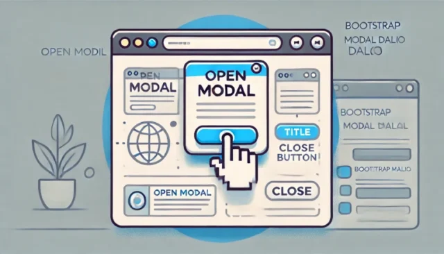
Bootstrap modal dialog are a popular way to display information or forms without leaving the current page. With just a few lines of HTML and JavaScript, you can implement a modal dialog that appears when users click a button. This guide will walk you through the steps to create a responsive modal dialog using Bootstrap.
What is a Bootstrap Modal Dialog?
A Bootstrap modal dialog is a popup window that appears on top of the main content, commonly used to grab user attention for:
- Showing notifications or alerts.
- Displaying forms for data input.
- Presenting additional information.
Modals in Bootstrap are built with HTML, CSS, and JavaScript. They are responsive and customizable, making them perfect for modern web applications.
How to Display a Bootstrap Modal on Button Click
Step 1: Include Bootstrap in Your Project
To use Bootstrap modals, ensure you have included Bootstrap’s CSS and JS files in your project. Add these links to your HTML <head> section:
<!-- Bootstrap CSS -->
<link href="https://cdn.jsdelivr.net/npm/bootstrap@5.3.0-alpha1/dist/css/bootstrap.min.css" rel="stylesheet">

<!-- Bootstrap JS Bundle -->
<script src="https://cdn.jsdelivr.net/npm/bootstrap@5.3.0-alpha1/dist/js/bootstrap.bundle.min.js"></script>
Step 2: Add HTML for the Modal
Define the modal dialog using Bootstrap’s modal structure:
<div class="modal fade" id="exampleModal" tabindex="-1" aria-labelledby="exampleModalLabel" aria-hidden="true">
  <div class="modal-dialog">
    <div class="modal-content">
      <div class="modal-header">
        <h5 class="modal-title" id="exampleModalLabel">Modal Title</h5>
        <button type="button" class="btn-close" data-bs-dismiss="modal" aria-label="Close"></button>
      </div>
      <div class="modal-body">
        This is the content inside the modal.
      </div>
      <div class="modal-footer">
        <button type="button" class="btn btn-secondary" data-bs-dismiss="modal">Close</button>
        <button type="button" class="btn btn-primary">Save changes</button>
      </div>
    </div>
  </div>
</div>
Step 3: Add a Button to Trigger the Modal
Use a button with the data-bs-toggle and data-bs-target attributes to trigger the modal:
<button type="button" class="btn btn-primary" data-bs-toggle="modal" data-bs-target="#exampleModal">
  Open Modal
</button>
Here:
data-bs-toggle="modal"specifies that the button will toggle a modal.data-bs-target="#exampleModal"points to the ID of the modal to be displayed.
How It Works
When the user clicks the button, the modal dialog is triggered, displaying the content inside the .modal-body section. Users can interact with the modal, and it can be closed using the “Close” button or the “X” icon.
Customizing the Modal
You can customize the modal dialog to suit your needs:
- Change Modal Size
Use the.modal-smor.modal-lgclass inside the.modal-dialogto change the size:<div class="modal-dialog modal-lg"> - Add Animations
Thefadeclass on the modal adds a fade-in animation. Remove it if you want the modal to appear instantly. - Set Backdrop Behavior
To prevent the modal from closing when clicking outside it, add thedata-bs-backdrop="static"attribute:<div class="modal fade" id="exampleModal" data-bs-backdrop="static">
Common Issues and Troubleshooting
Modal Not Displaying on Button Click
Ensure the modal’s id matches the data-bs-target attribute of the button.
Bootstrap Files Not Loading
Verify that the Bootstrap CSS and JavaScript files are correctly linked in your HTML.
Modal Does Not Close
Ensure the close button has the data-bs-dismiss="modal" attribute or use JavaScript to close the modal manually:
var myModal = new bootstrap.Modal(document.getElementById('exampleModal'));
myModal.hide();
Why Use Bootstrap Modals?
- User-Friendly: Modals are an intuitive way to display additional content without leaving the page.
- Customizable: Easily adapt modal content, size, and behavior to match your project’s needs.
- Responsive: Built to look great on all screen sizes.
Conclusion
Bootstrap modals are a powerful feature for enhancing user interaction in web applications. By following the steps outlined in this guide, you can quickly implement a modal dialog triggered by a button click. Experiment with customization options to create modals that fit seamlessly into your design.
Start using Bootstrap modals today to improve the user experience on your website!
